In this project we are going to analyze pollution data of the city that has touched us, in my case it has touched me Constantí. What I have done is to download the pollution data from 1991 to 2023 from the data page of the Generalitat. Then I have analyzed it in RStudio, in order to see if the pollution limit is exceeded.
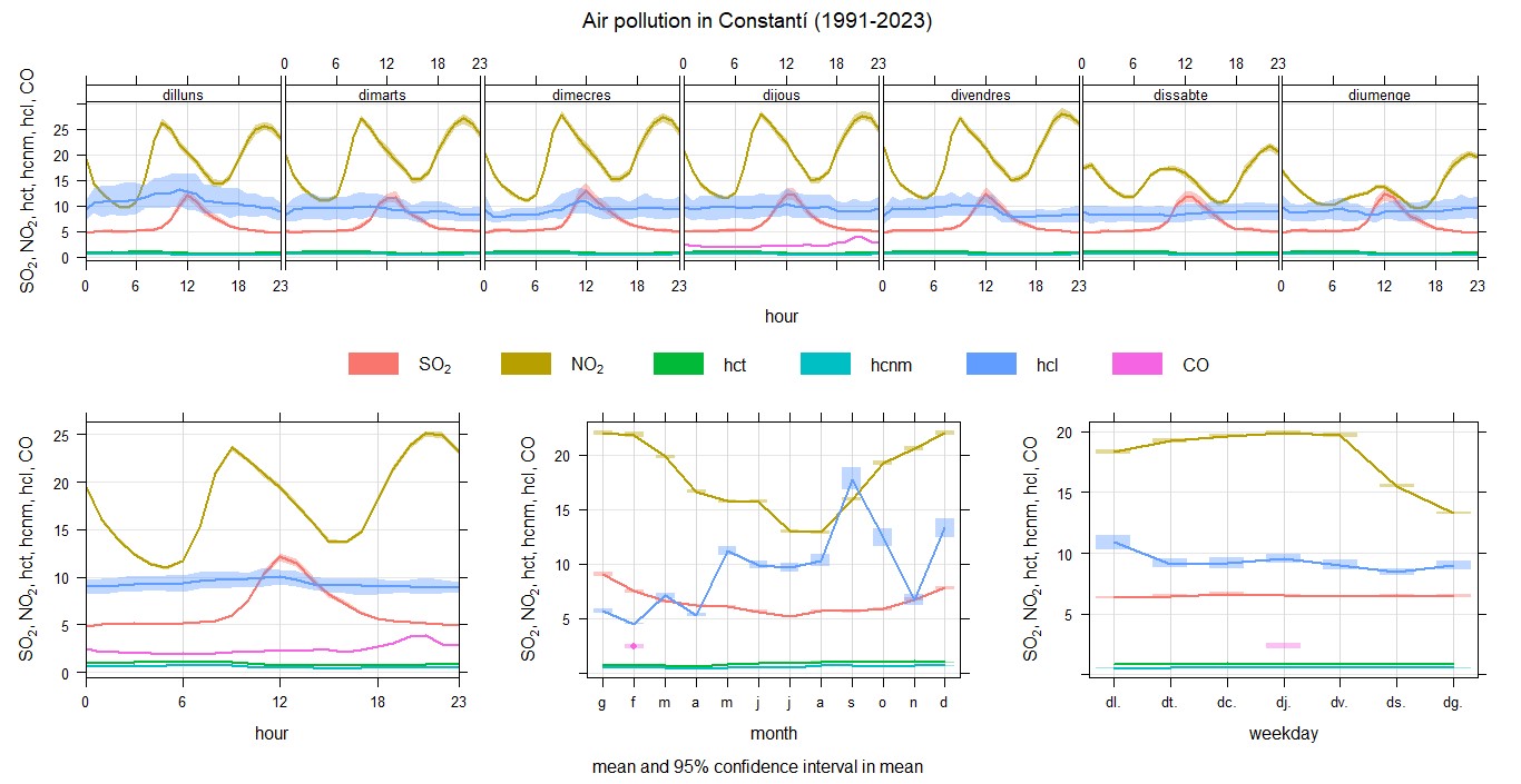
Here you can see the TtimeVariation as you can see in the graph there is less pollution on weekends, as some of the main reasons are that there is less industrial activity, less vehicular traffic and less energy use than during the week. In addition, you can see that between 00:00h and 06:00h there is less pollution, as people are usually sleeping, so less energy is required and less pollution will be generated.
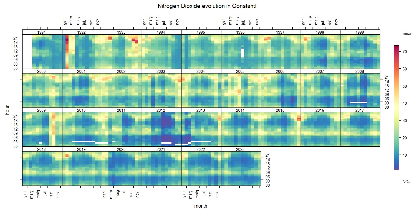
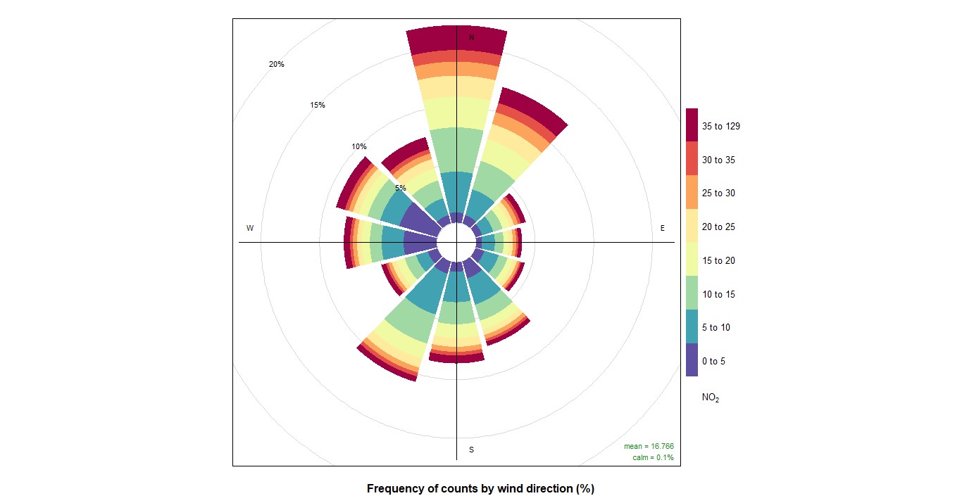
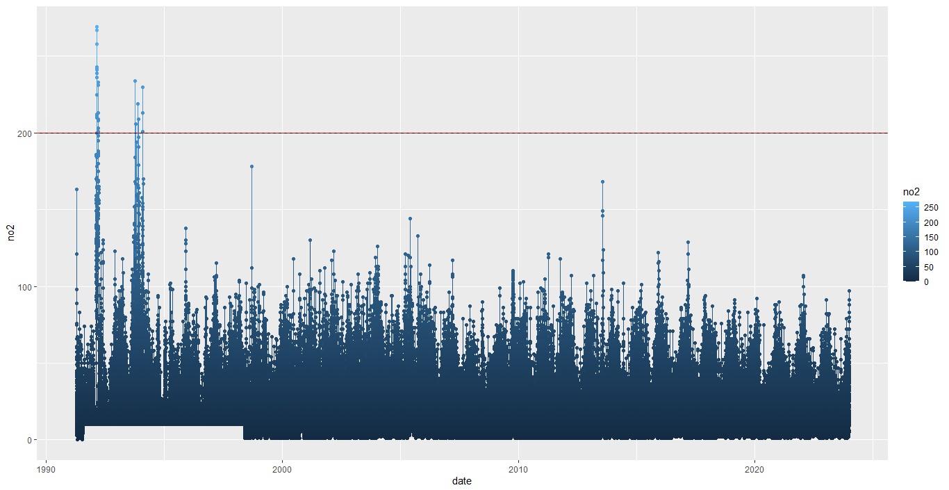
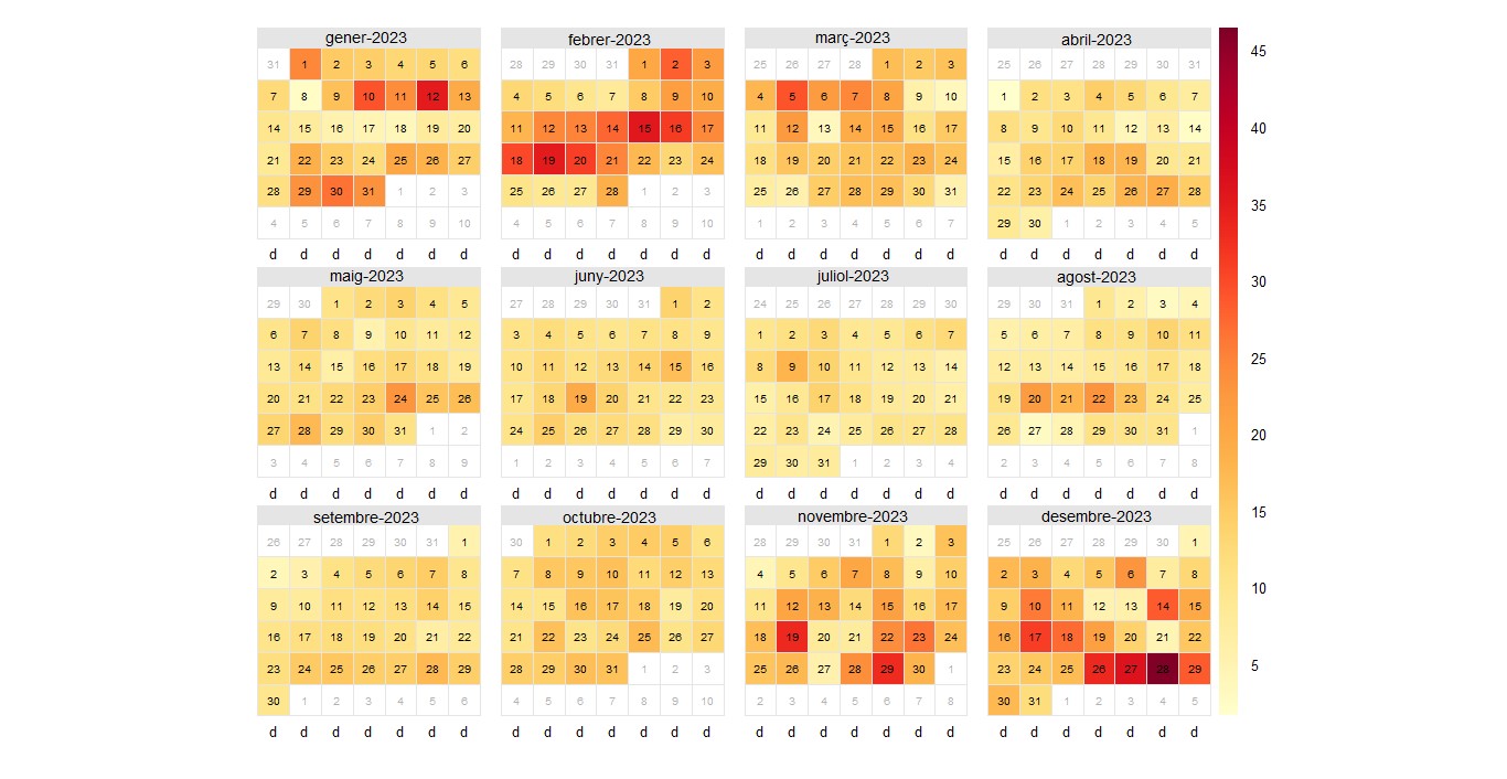
Here you have the NO2 graphs in it you can see that it does not vary too much, except between 1991 and 1995 it goes over the limit. In this case the EU and WHO limit is 200. You can also see a wind graph, in this one you can see that pollution comes from the north, this is due to the fact that there are factories north of Constantí. In the daily data for 2023, it can be seen that there is more pollution in January, February, November, and December.
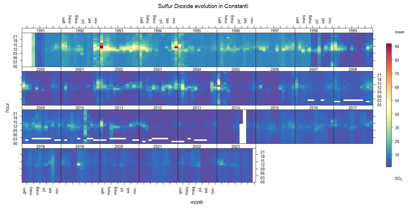
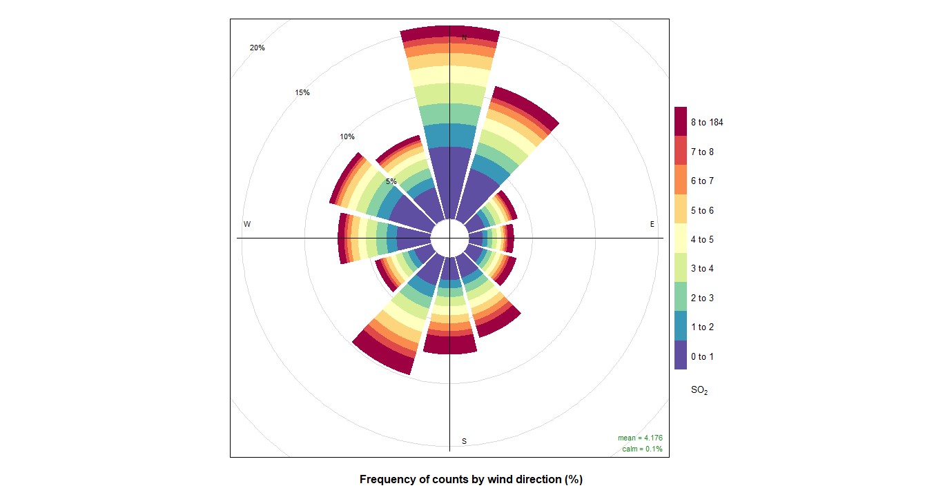
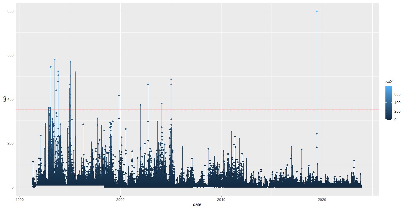
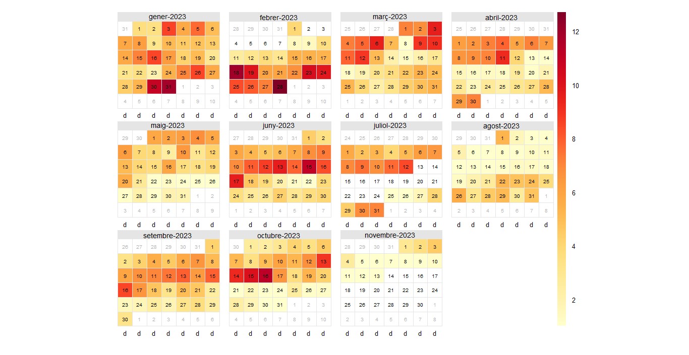
Here you have the SO2 graphs, in it you can see that it does not vary too much, except in special cases, it goes over the limit several times, in this case the EU limit 350 per hour. You can see in the graph that the limit is passed several times from 1991 to 2007 approximately and then the limit is passed again in 2019 or 2020, which is the year of the pandemic. You can also see a graph of the wind, in this you can see that pollution comes from the north, this is because there are factories to the north. In the daily data for 2023, it can be seen that there is less pollution in August and November.
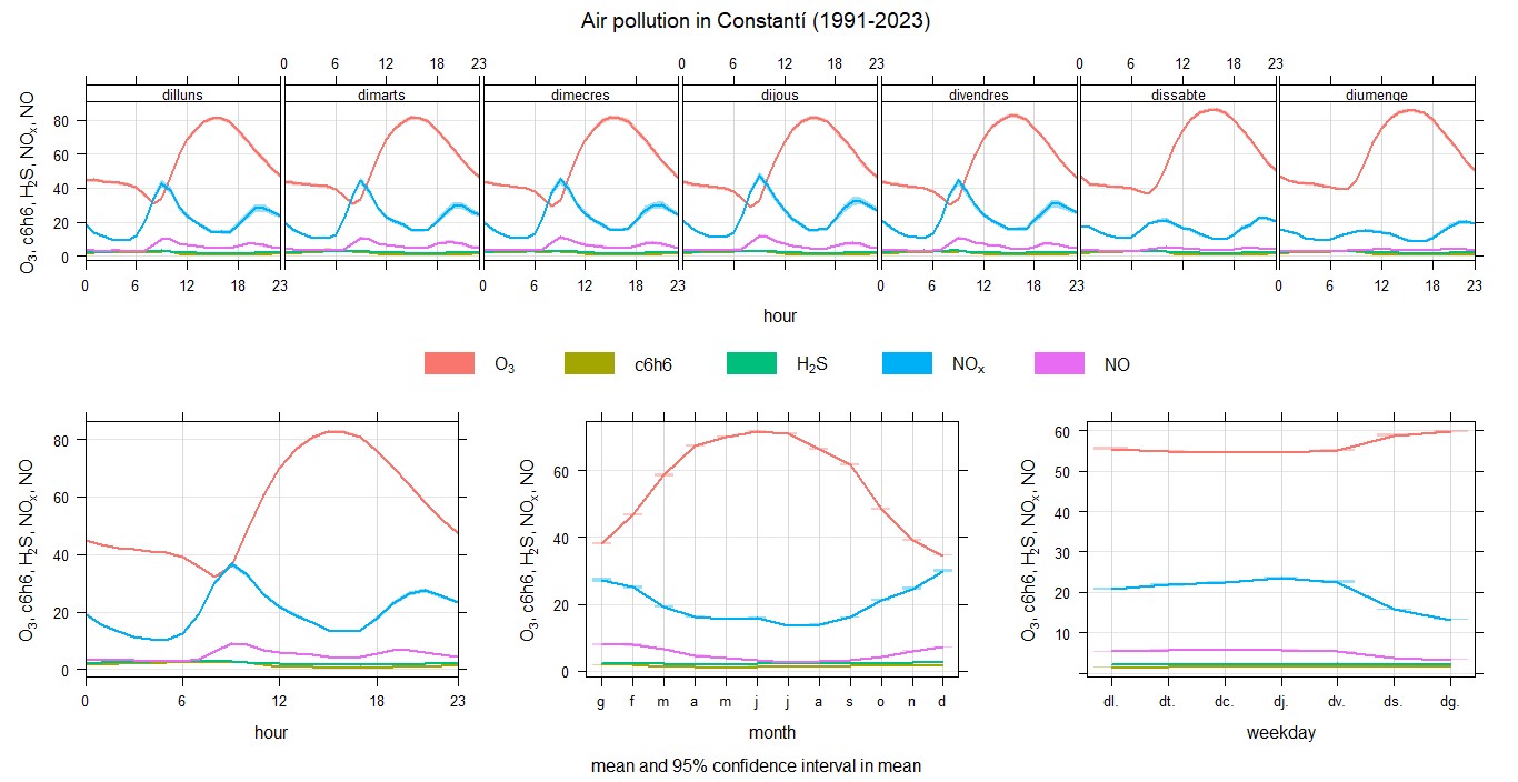
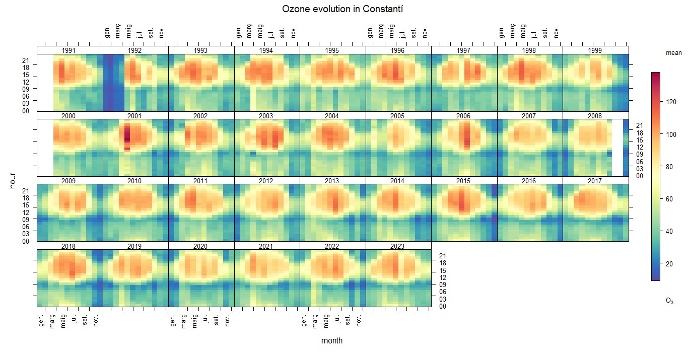
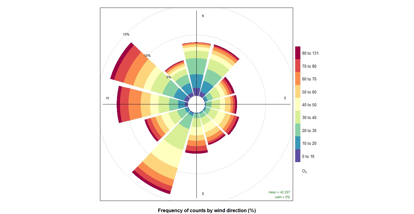
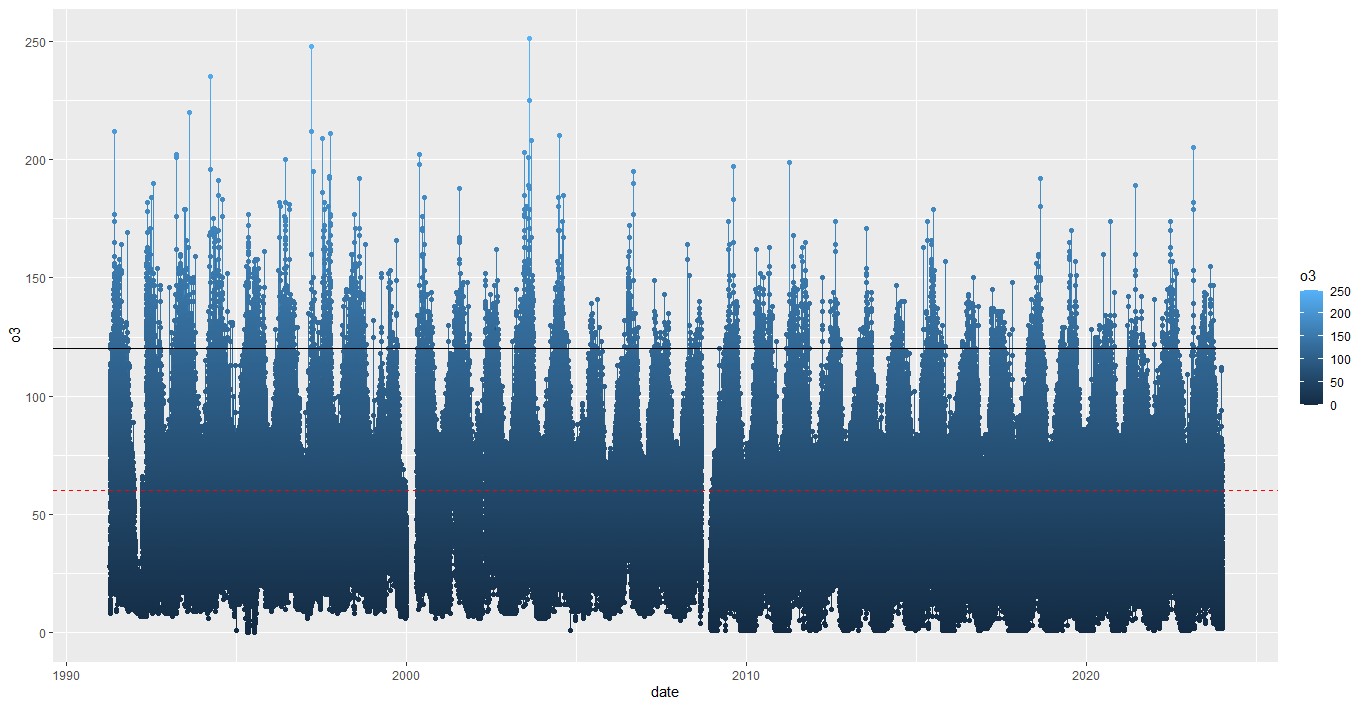
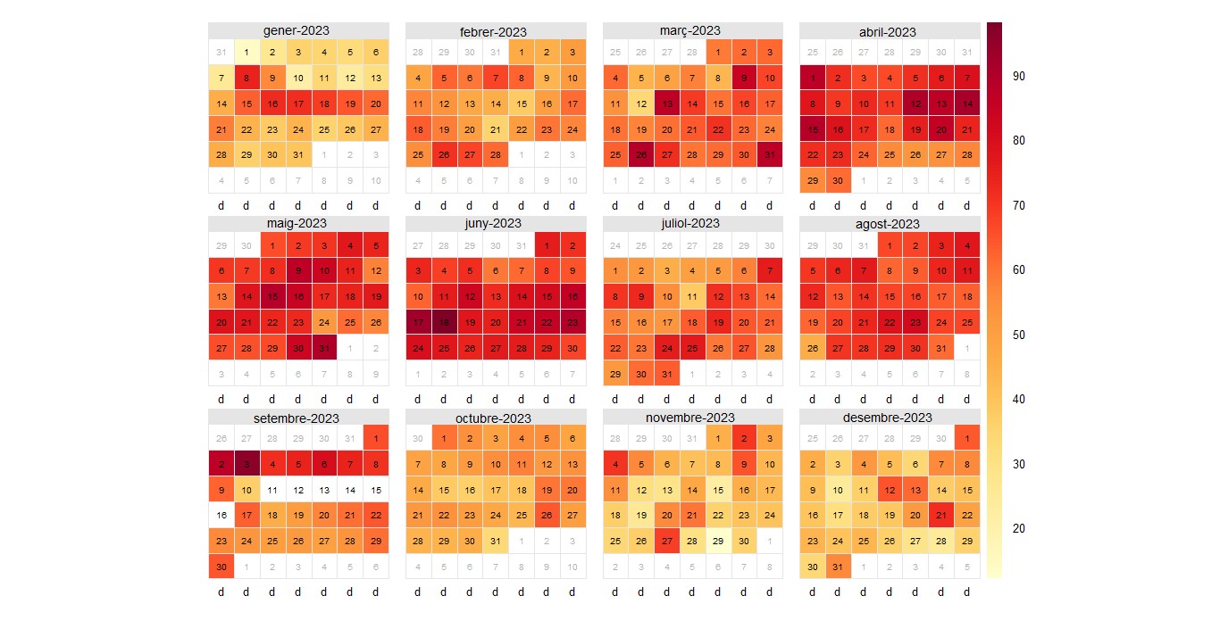
Here you have the O3 graphs, in it you can see that there is a lot of O3 activity, this is due to the lack of emission control, favorable meteorological conditions for the reaction, since O3 is formed when nitrogen oxides (NOx) and volatile organic compounds (VOC), emitted mainly by motor vehicles and some industrial sources, react in the presence of sunlight to form O3. It can be seen that the limit is exceeded many times, in this case the EU 120 and WHO 60 limit for 8 hours. You can also see a wind graph, in this one you can see that pollution arrives from west. In the daily data for 2023, it can be seen that there is a lot of pollution throughout the year.
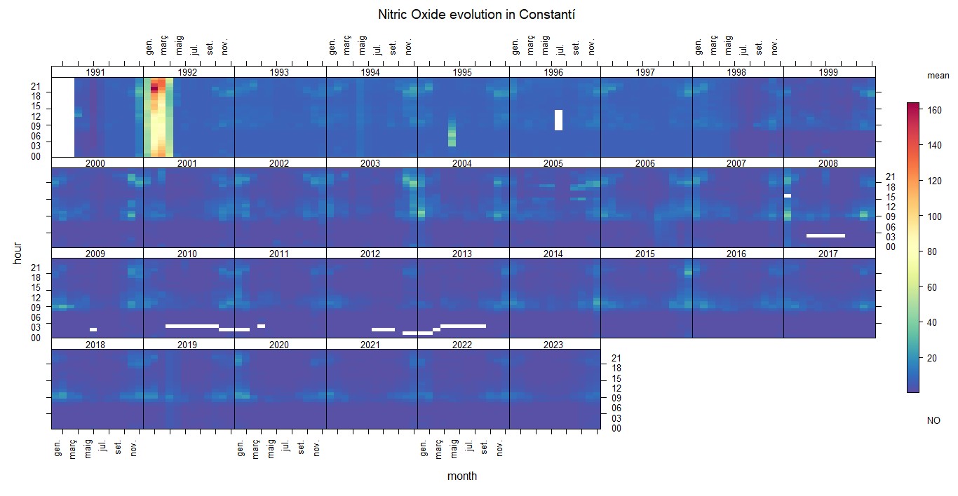
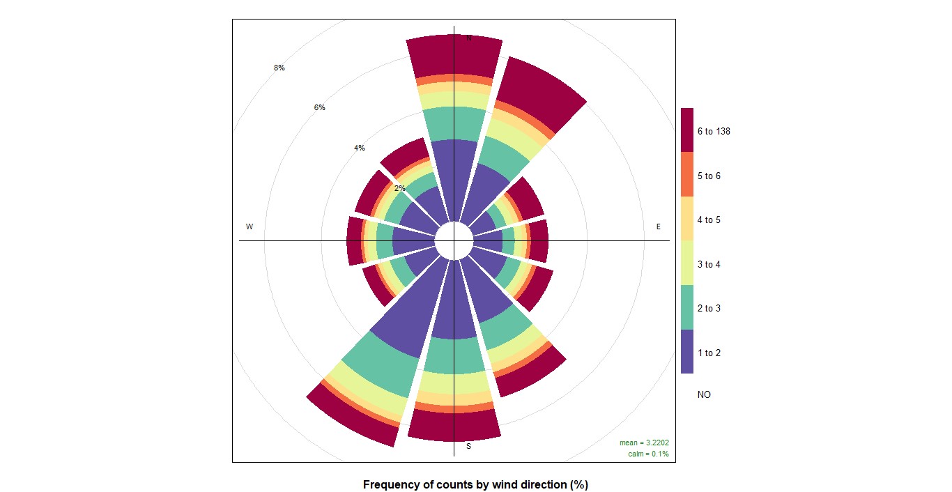
Here you have the NO graphs, in the TrendLevel you can see that it is maintained in low NO pollutants, but, on the other hand, in the wind you can see in the graph that more pollution and with more speed arrives from the south and north. In the daily data for 2023, it can be seen that there is more pollution in January, November, and December.
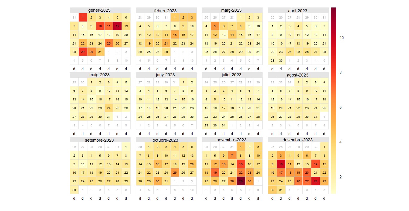
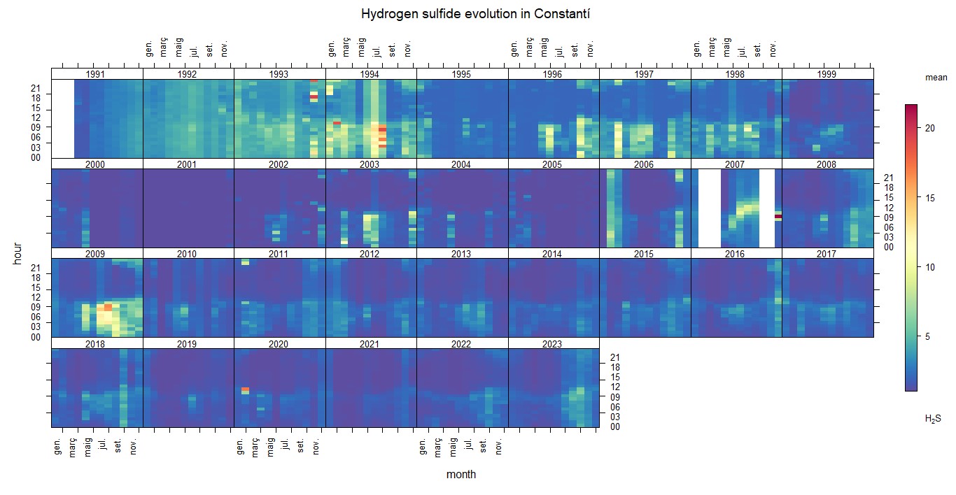
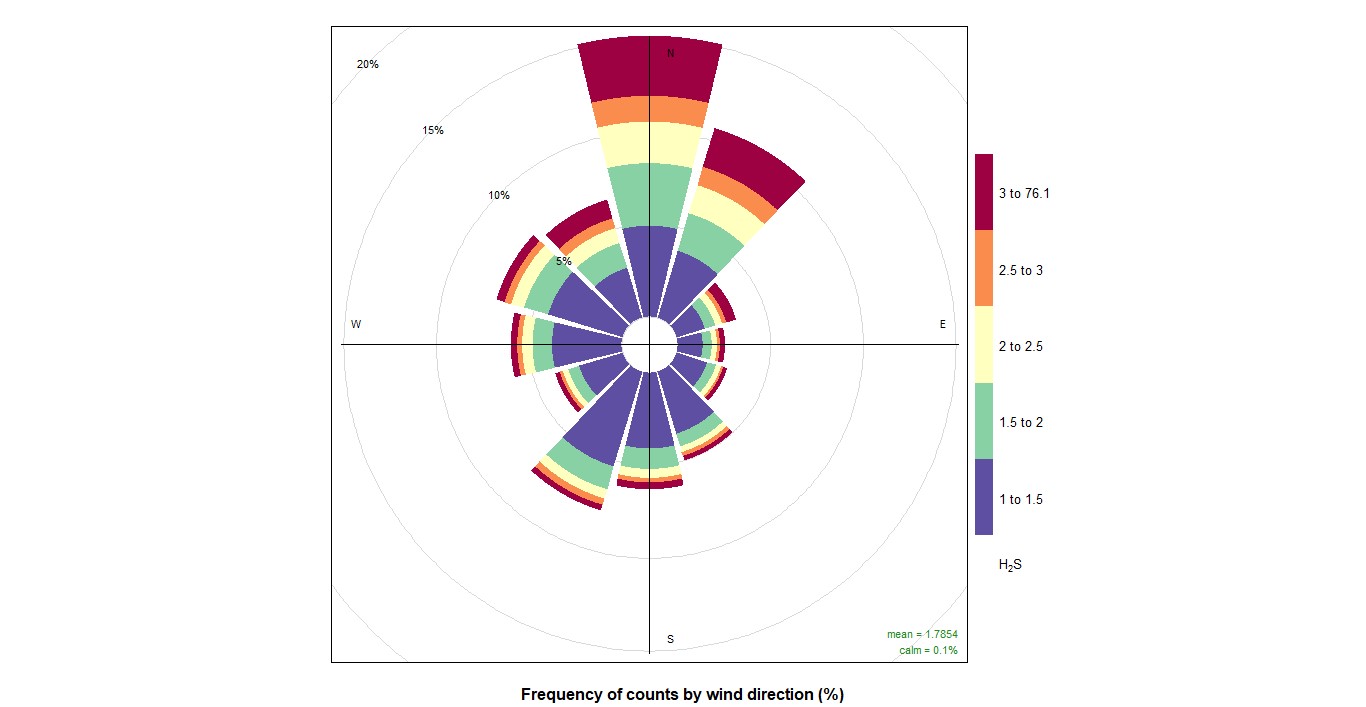
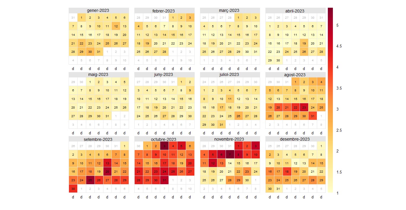
Here you have the H2S graphs, in the TrendLevel you can see that it is maintained in low pollution does not vary almost, but in some special cases if, on the other hand, in the wind you can see in the graph that arrives more and with more speed pollution from the north because of the factories. In the daily data for 2023, it can be seen that there is more pollution from August to November.
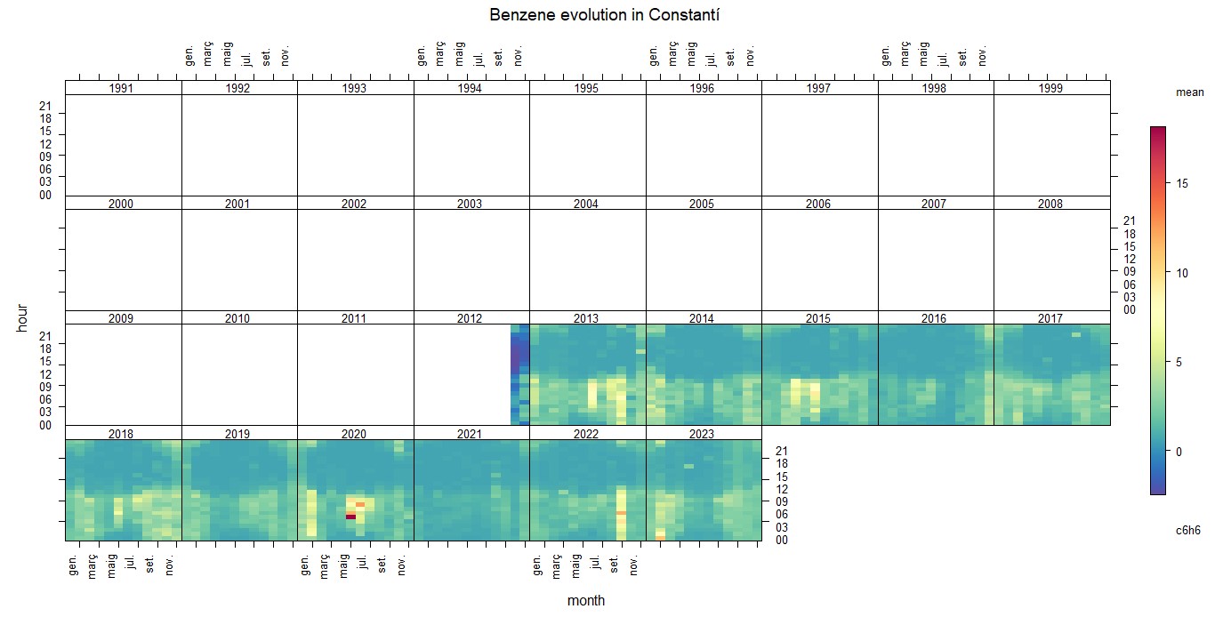
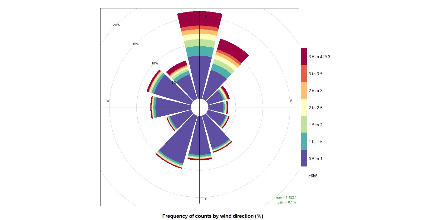
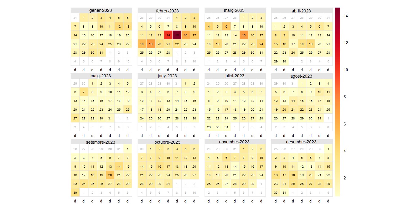
Here are the graphs for C6H6. In the TrendLevel graph, you can see that measurements start from late 2012. It can be observed that pollution remains almost constant and hardly varies, but in some special cases, such as in May or June 2021, there is more pollution. On the other hand, in the wind graph, it can be seen that pollution arrives more frequently and with greater speed from the north due to the factories.In the daily data for 2023, it can be seen that there is more pollution on February 14th and 15th.
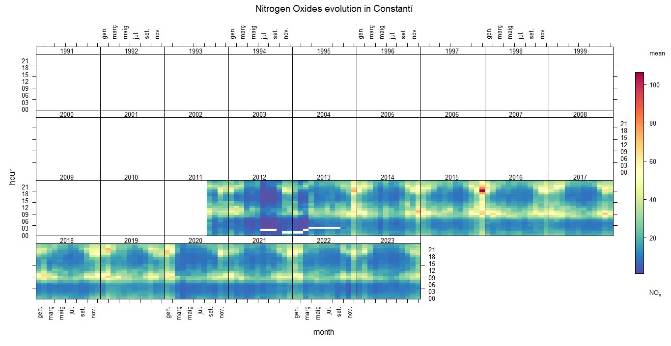
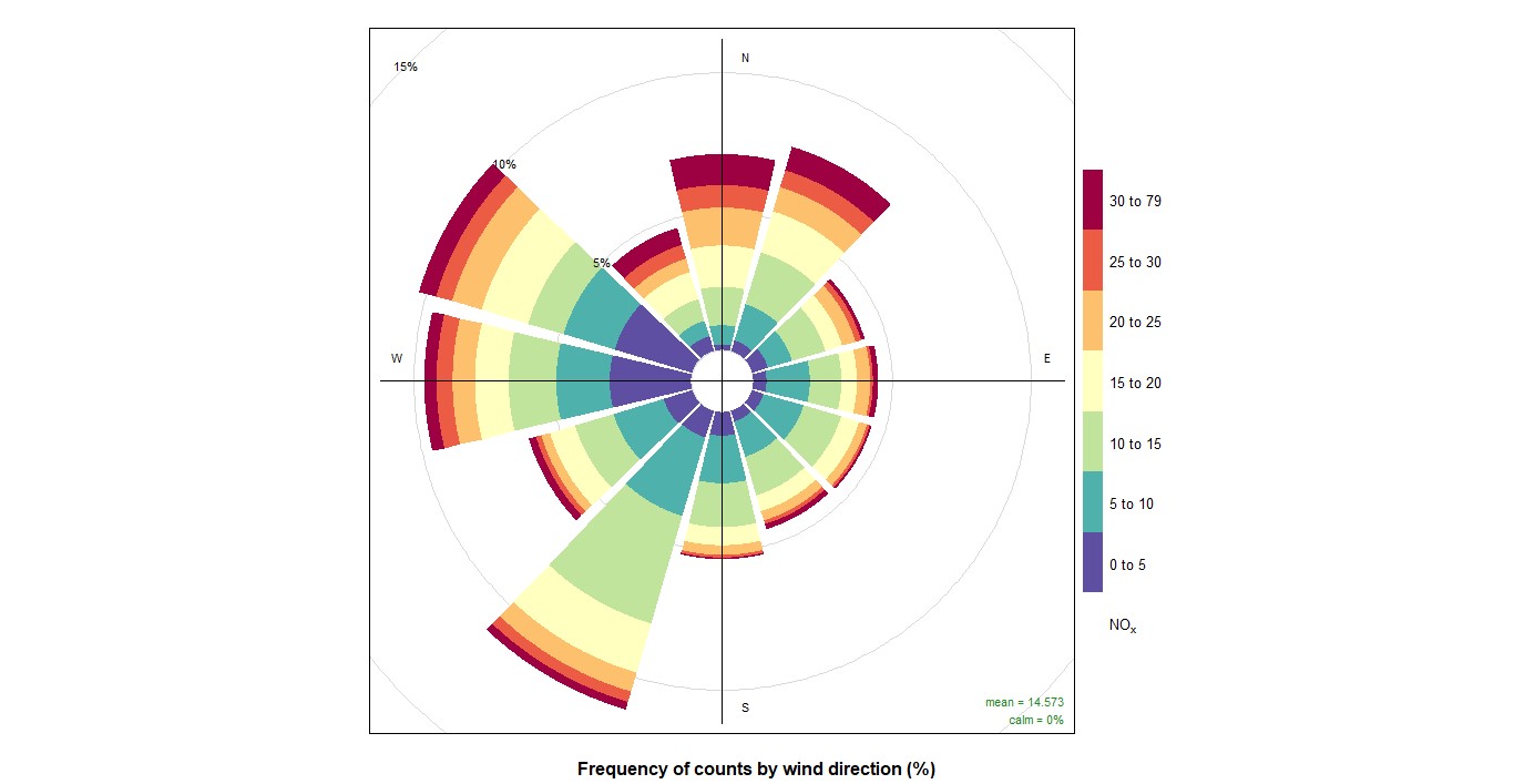
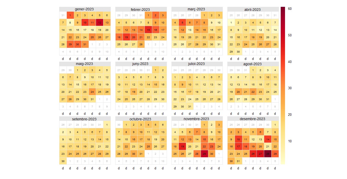
Here are the NOX graphs. In the TrendLevel graph, you can see that measurements start from late 2011. It can be observed that pollution remains almost constant and hardly varies, but in some special cases, such as at the end of 2015, there is more pollution at night, which may be due to higher-than-usual heating consumption. On the other hand, in the wind graph, it can be seen that pollution arrives more frequently and with greater speed from the north due to the factories, also from the south and more extent from the west. In the daily data for 2023, it can be observed that there is more pollution in January, February, March, November, and December.
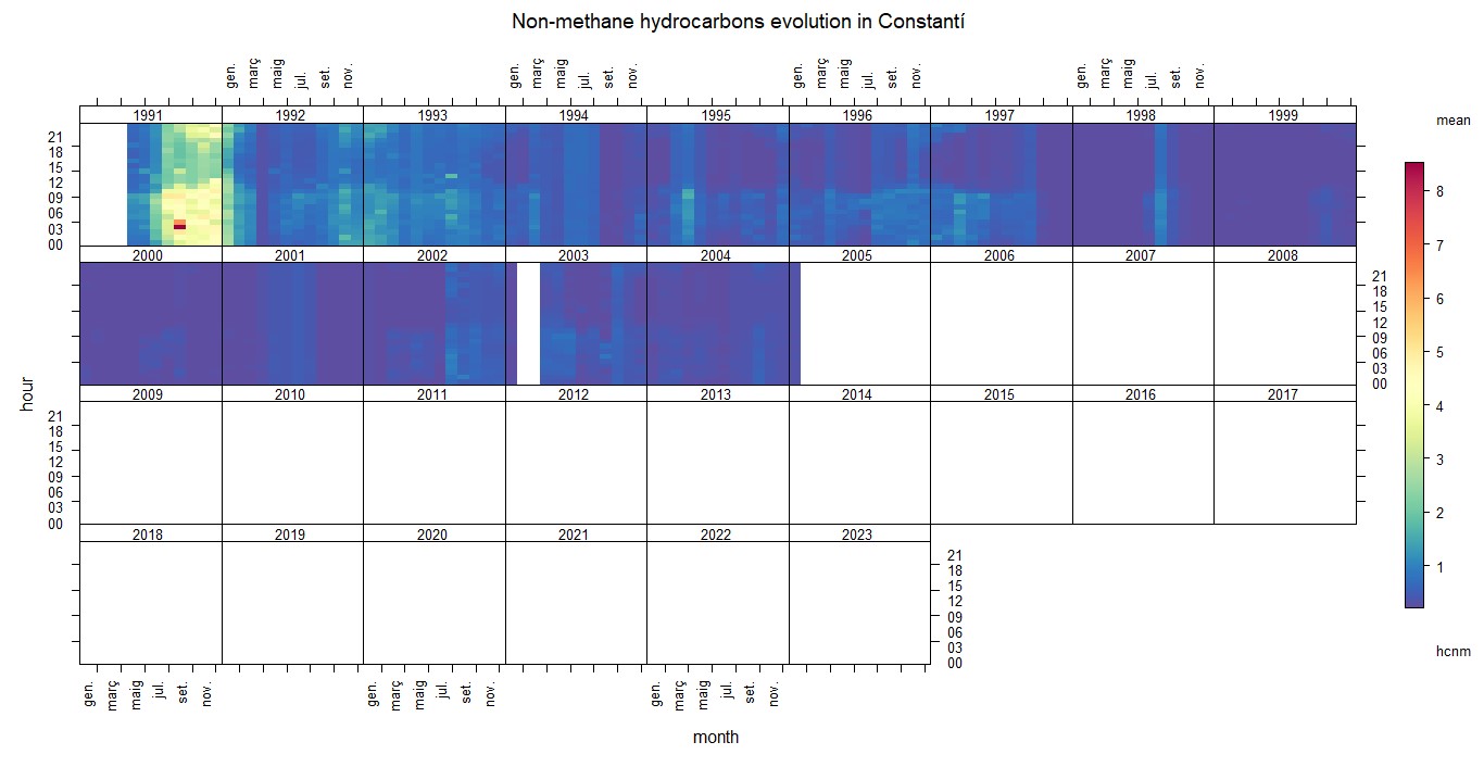
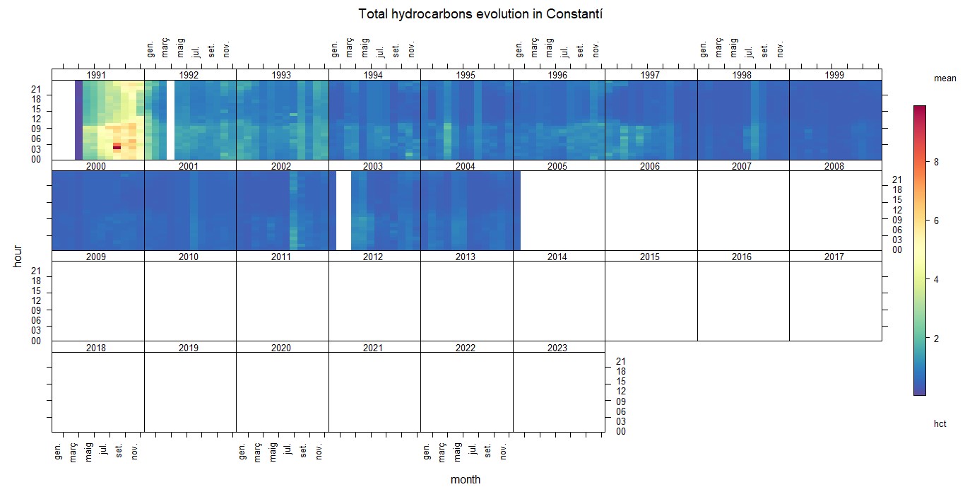
Here are the HCNM and HCT graphs. In the TrendLevel graph, it can be seen that pollution remains almost constant and hardly varies, but in some special cases, such as in 1991, there is more pollution. It's also noticeable that data counting stops in 2005, and there is no wind graph available because the data counting stops there as well.
In conclusion, in this work, I have analyzed pollutants as you have seen with RStudio, with the aim of creating visual graphs of daily, hourly, and yearly pollution in Constantí to determine if they exceed the pollution limits set by the EU and WHO.